 Mary Atamaniuk
Modern UX principles revolve around minimalism. The less you notice the design, the better UX you have.
As Irene Au said,
Good design is like a refrigerator—when it works, no one notices, but when it doesn’t, it sure stinks.
So the task of a modern UX designer is to make a design that works “behind the curtain,” silently changing the “decorations.”
This invisible design is an integral part of a successful release of a product that is both functional and visual. And this is what defines the new era of design.
In this article, we are going to explain what effective product design is, and why making it simple is always better than making it heavy.
Table of Contents
The state of flow
The “state of flow” term was first discovered by Mihaly Csikszentmihalyi, a Hungarian-American psychologist.
According to his research, a state of flow is a challenge-skill balance. By acquiring the challenge that matches your skill and pushes you a little further each time, you can enter a state of flow or optimal experience.
A state of flow makes you lose track of the time. You are doing the task just for the sake of doing it, without any interruptions.
But what does the state of flow have to do with a product design? Actually, quite a lot.

As a designer, you can use the flow to direct the UI design, so-called behavioral design. The software interface should create conditions that are favorable for the user to enter the state of flow.
As a result, they will be able to use the software for their specific needs, not thinking about its interface.
Here are the basic rules that you should comply with if you want your users to enter the state of flow:
Reduce the number of user’s interactions with the software
The more work the user has to do within the software, the more bored they become. As a result, they will lose the state of flow, and you will also miss out on this user. Therefore, your task to help the client achieve their goals as quickly as possible.
Design an intuitive, self-documented interface
Make the UI as comprehensible as possible, so the user will not need any extra software documentation to understand the product. As a result, nothing will interrupt their interaction with the software.
Reduce the clutter
Your design should have several drafts and iterations, each of which should be more and more minimalistic. With each draft, try to remove the elements that would distract the user, leaving only the most important features.

Keeping it simple: 5 UX principles to guide product design
UX design is the process of creating products, systems, or services that deliver relevant and meaningful experiences to users. This includes acquiring and integrating the product, branding, usability, and functionality.
It also involves various aspects of human-computer interaction and product ownership. Basically, this is how the user interacts with the product.
The key task of UX design is to create products that can be tailored to the specific needs of the user, but which delivers predictable functionality. In other words, UX design should study user behavior and understand their motivation with the primary goal to create better digital experiences.
Here are the basic UX principles to follow in product design:
Digestibility
The design should be intuitive and easily understood by users. People sometimes need guidance to make decisions, so you can build these guidelines into the design.
Remember – people should use your product and not spend their time figuring out how to use it.
For example, you can use the hierarchy in the form of size, color, or icons to organize the UI. You can also highlight the more common choices, which allows the user to find what they are looking for faster.
Familiarity
The design should look native on a platform it is originally created for. Each platform has its own guidelines, so be sure to comply with them. When the user sees familiar icons, patterns, and styles, it will be easier for them to get around in the product and receive a great user experience.
Trust
To build trust with your users, you should clearly explain each of their steps within the software at least once.
Before asking the user to complete an action, make an effort to help them understand why they need to complete it.
For example, when the user needs to provide some personal data, you should explain to them that their data will never be shared with any third parties.
Honesty
Make things as transparent as you can within your software by building open, shared, and honest communication with your clients. Pricing is the most important area that deserves clarity, so explain each pricing option as clearly as possible.
For example, if the software includes a free trial, make sure that you warn the user about the date when it is switched to a paid version.
You must also ensure the user that they can opt-out at any time. Step into the shoes of your users and explain things like you would want them explained to you.
Accessibility
It is critical that the product can be easily understood and used by people of all abilities. Accessibility is about anyone who is experiencing any permanent, temporary, or situational disability.

You should keep this in mind when designing the UI elements. For example, do not use only color coding because colorblind people will not be able to use the product. Instead, use the combinations of text, color, or graphical objects.
From UX to CX: 3 simple steps
User experience becomes a customer experience at the moment when a visitor is converted to a customer. Though statistics show that many visitors leave and never return because of poor UX.
It often happens at websites such as e-commerce portals. For example, according to a report by the Society of Digital Agencies (SoDA), 77 % of agencies believe that a bad user experience at a website is a weakness for their clients.
Therefore, if you want to retain your customers, you must deliver effortless and seamless experiences that encourage them to return. Here is what you should take into account when measuring the CX for your product or website:
Customer journey
You can measure how the customer behaves within your app or at your website, i.e. on which pages they spend most of their time and which elements they interact with.
Such metrics will help you find out why customers leave, e.g. abandon the shopping cart, and what should you do to improve this experience and thus retain the customers.
Net Promoter Score (NPS)
An NPS is an alternative to traditional customer satisfaction research that involves only one question:
Would you recommend our product to a friend or colleague?
The customer responses are based on a 0 to 10 scale. The NPS is then calculated as follows: Percentage of Promoters (those who scored 9 to 10) minus Percentage of Detractors (those who scored 0 to 6). For example, if you have 40% promoters and 20 % detractors, your NPS would be 20%.
A “positive” NPS above 0 is considered “good”, +50 is “excellent,” and above 70 is “world-class.” But if the NPS is below 0, it means that your company must take immediate actions on improving the customer experience, highlighting the relevance of NPS tools in assessing and enhancing customer satisfaction.
Customer Effort Score (CES)
This metric helps you define the effort that your customers need to take in order to complete a certain task, such as finding the functionality they were looking for.
It is typically measured by sending customers an automated post-interaction survey asking them to rate a specific statement on a defined scale.
3 Layers of invisible design
Speaking about invisible design again – the invisible designs of software products involve the aesthetic, interactive, and product-related layers. Let’s take a closer look at each of these layers.
1. Aesthetic layer
This type of invisibility pertains to the aesthetics of the product’s user interface. This is the first level that the user sees, so it should be visually appealing but not overwhelming.

Exactly the interface aesthetics impact the user’s decision of whether they want to continue interacting with the software and thus move to the next level.
2. Interactive layer
This component of the invisible design is related to interactions and notifications within the software. If they are invisible, they happen so seamlessly that the user performs an action without thinking about it – just like when entering the state of flow.
Just a decade ago, software products used to be overloaded with features advertising what the product can do. Today’s trend is the “silent”, user-centric product.

Instead of endlessly complicated workflows, now it takes the user just a couple of clicks or swipes to complete a certain action. The designers now remove the features from the user’s line of sight only to show it at the right moment. That’s what invisible interactivity is about.
3. Product layer
The third layer pertains to the product as a whole. This involves the brands and advertising that the user might not even notice. Such products require an entire network of automated processes running in the background just to save the user even from the minor inconvenience.

They are seamlessly integrated into the user’s daily routine so they can even forget that they are actually interacting with a specific brand. No more annoying ads shouting about the new features – the new era design is now user-centric, not product-centric.
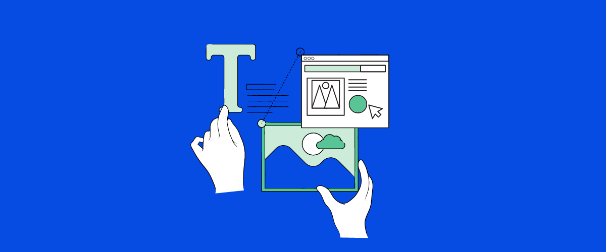
How to use different design techniques in your product
Ability to use color, images, icons, text, typography, and other methods to get a message across belongs to the basics of invisible design aesthetics. Here’s how it works:
Color
Choose the colors that you use very carefully, with specifics of different cultures in mind because specific colors or their combinations may have a certain meaning for various cultures. Colors help users perform specific actions as well as create the right feel, harmony, and balance.
Images
Quality images include not only photos but also videos and animations. If you decide to shop on photos, ensure to take quality photos to modify them accordingly. In invisible design, use the images sparingly. Use top-notch photos, films, or animations to improve the viewer’s visual experience. Include pertinent images that will aid consumers in understanding the information or interacting with, say, a blockchain program. For instance, you may describe complicated ideas or procedures using swimlane diagrams or infographics.
Typography
Typefaces that you choose can also have meanings. For minimalistic design, heavy, baroque style typefaces are not something that you should focus on. If you are not sure which font to use, stick to sans serifs or simple serifs, which have uniform stroke widths in a regular weight.
Text and tone
The words that you use convey a tone and provoke an emotional response from users. Apply the tone and voice that communicate the way you want people to feel when they interact with the design.
Appeal to your target audience and, depending on who they are, choose a tone. It can be formal but friendly and engaging, or completely informal and even comical. Additionally, think about the rhythm of the words and how they sound when you read them out loud.
Icons and user interface elements
A consistent set of icons and UI elements is another integral component of design invisibility. This invisibility happens when the user does not have to think about how it works. Therefore, the elements should be uniform and easily understandable, just like the shopping cart icon.
The bottom line
The invisible design is a kind of UI / UX design that ensures the user’s seamless interaction with the product, to an extent that they hardly notice the design elements. In other words, the user should enter the state of flow when working with your product. You can achieve that in the following way:
- Reduce the number of the user’s interactions with the software
- Build an intuitive interface
- Reduce the clutter
The basic user experience design principles to ensure invisible product design are as follows:
- Digestibility: The design should be intuitive and easily understood by users.
- Familiarity: The design should look native on the platform for which it is intended.
- Trust: To build trust with your users, you should clearly explain each of the user’s steps within the software at least once.
- Honesty: Make things as transparent as you can within your software.
- Accessibility: The design should be easily understood by people of all abilities.
Finally, the invisible design consists of three layers that involve aesthetics, interactivity, and the product itself.
It means that you as the designer should take the user’s side, showing them that you care about their experience with the product.
Take a look at the product from the user’s perspective and design it as if you were the end user. Good luck!?

 Vineet Gupta
 Ashwini Dave
 Svetlana Shevchuk
 Iryna Bilyk