
If in 2021 the content is king, visualization must be its crown. Data visualization allows people to process data more efficiently by presenting it in a more accessible way. In this new era of remote and hybrid work, it is vital to have all the needed tools and software that can help to avoid any miscommunication and represent the data to other team members as efficiently as if we were working in the office.
Luckily, today you don’t have to hire a professional designer to create an infographic or a stunning presentation online because numerous data visualization tools can help your team collaborate on visual projects productively even when everyone keeps working from home.
Data visualization allows you to present gathered information in a more memorable and exciting way. Studies by Buffer and others have proven that people retain up to 65% of the data from visual content after three days. On the other hand, only 10% of written or spoken content is remembered after the same period.
We curated ten top-notch visualization tools with collaborative features for different business needs to help your team present data in the most productive way and get noticed by your target audience.
 Shot by Lidia Drozdova for FlowMapp
Table of Contents
Graphic Design
Visme
Visme is generally a platform for content creation. It allows users to build and share visual data through presentations, reports, wireframes, infographics, and other types of content.
At its core, Visme is a visualization tool that transforms data and spreadsheets into visual content. It also has numerous useful collaborative and analytical features, which makes it worthy of its price.
Advantages: Visme is web-based but can run offline and has many customization options, including templates, fonts, etc., essential for building brand identity and sharing opinions with team members. It also includes analytics features.
Cost: Has a free plan. A business plan with collaborative features is $29/user/month billed annually.
Website: Visme
Canva
Canva is a popular graphic design platform widely used for data visualization and the creation of infographics, flyers, posters, CVs, PDF Editor, etc. It has an extensive library of templates, fonts, photos, and the fundamentals of building a brand book. Team members can invite each other to edit and comment on creatives.
Advantages: Non-designers widely use Canva because of its intuitive UI and comprehensive library of ready-to-use templates.
Cost: Has a free plan. Pro plans start from $8.99/month.
Website: Canva
Mixbook
Mixbook is a website that allows users to create unique, personalized photo books and cards. With its user-friendly interface, Mixbook provides an easy way to customize your own designs with photos, text, and other elements. It also offers an array of products ranging from scrapbooks and photo albums to wedding invitations and thank you cards. With a wide selection of designs and options to choose from, Mixbook gives users the freedom to express their creativity and showcase their special memories in a truly unique way.
Advantages: One of the key advantages of Mixbook is the ease of use and convenience that it offers. The simple, intuitive user interface makes creating personalized photo books and cards easy and stress-free. Furthermore, the website provides an array of custom designs and options to choose from which allows users to showcase their creativity and create unique items.
Cost: Mixbook offers some of the most affordable options when it comes to custom photo books, cards, and invitations. The website also offers discounts for certain orders and often runs special promotions and sales, making creating custom projects more affordable.
Website: Mixbook
Venngage
Everyone can create reports, presentations, charts, or more complex designs using Venngage Infographic Maker, which has a large selection of themes and color schemes. You can add data to your pictures and edit the text, images, and symbols with only one click. As a result, design is made incredibly rapid and simple.
Create engaging infographics, share your stories, and visually display your facts. Venngage offers tools and templates to provide the best design experience possible.
Advantages: You don’t have to be a designer to use Venngage. There are 10,000+ infographic templates easy-to-edit and 3+ million stock photos and 40,000+ icons and illustrations to jazz up your visuals.
Cost: Venngage has a free plan. Pro plans start from $10.
Website: Venngage
SlideModel
SlideModel is an online platform that provides PowerPoint templates, pre-designed diagrams, charts, and other visual aids for creating professional-grade presentations, visualizations, and infographics. With a vast library of thousands of unique templates and over 50 categories, SlideModel offers a range of professional and easy-to-use slide templates that help you create impressive presentations in less time. The slide templates are fully customizable, allowing users to change colors, add images and modify the text, making it easy to personalize the presentations to match your brand’s style and message.
Advantages: SlideModel can help you save time by providing ready-to-use templates so you don’t have to start from scratch. The templates available on SlideModel are designed to be professional and engaging, which can make your presentations stand out.
Cost: 3-month plan starting at $59.90/quarter. Annual Basic plan starting at $99.90/yr. It has a free tier.
Website: SlideModel
Wepik
Wepik is another popular graphic design platform with a range of powerful tools for data visualization and the creation of infographics, flyers, posters, CVs, etc. It has an extensive library of templates, fonts, photos, and the fundamentals of building a brand book. Team members can invite each other to edit and comment on creatives. Wepik also has a feature that allows users to transform the text into images, making it easier to create visuals.
Advantages: Wepik is a great tool for creating visuals quickly and efficiently. It also provides a wide range of powerful editing tools.
Cost: Has a free plan. Pro plans start from $3.99/month.
Website: Wepik
BeFunky
BeFunky is a revolutionary photo editing and graphic design platform that helps users create flyers, posters, and collages using templates. It’s also capable of editing photos and adding filters seamlessly. BeFunky has an extensive library of stock images and vector graphics, which creators can use in their branding and marketing materials.
Advantages: BeFunky allows designers and non-designers to edit photos with one click. This makes complicated editing tasks, like removing backgrounds and cloning objects, a breeze.
Cost: Has a free plan. Pro starts at $4.99/month.
Website: BeFunky
Infogram
Infogram is a visualization tool that offers a great library of infographic templates to create eye-catching reports.
Infogram has 35 interactive chart formats and over 500 maps, interactive dashboards, and reports. The drag-and-drop editor lets you customize creatives, and everything can be pasted in as a table. Team members can leave comments inside the project.
Advantages: All infographics can be published online or exported to the most common file formats, including PDF and JPG. Plus, there’s a training program for users who want to learn advanced features of Infogram.
Cost: Has a free plan. The team plan with collaborative features is $149/month.
Website: Infogram
PhotoADKing
PhotoADKing is an online graphic design software commonly used for data visualization and the creation of flyer designs, posters, infographics, YouTube thumbnails, CVs, etc. Graphic designers, freelancers, students, and all kinds of artists can use PhotoADKing’s templates, fonts, photographs, graphics, animations, and more.
Advantage: You don’t have to start from scratch. PhotoADKing has more than 10000 templates to choose from and a tool to customize them accordingly. Besides all, PhotoADKing offers 10 free templates to new users after signing up.
Cost: Has a free plan. Pro plan starts from $9/month.
Website: PhotoADKing
Appy Pie Design
Appy Pie Design has revolutionized content creation with its intuitive platform. With a user-friendly interface and a plethora of design tools, anyone can craft stunning visuals effortlessly. Whether you’re a seasoned designer or new to the world of content creation, the platform offers endless possibilities for bringing your ideas to life. Plus, with our AI Video Generator feature, you can easily create captivating videos in minutes, saving you time and effort.
Advantage: The key advantage of Appy Pie Design is Simplified Content Creation. Our platform streamlines the design process, making it accessible to everyone, regardless of skill level.
Cost: The monthly plan starts at $8.
Website: Appy Pie Design
Presentations
Pitch
Pitch is easy-to-setup presentation software that helps teams to create and distribute beautiful presentations more efficiently. Even non-designers who want to create beautiful and creative presentations without spending too much time can benefit from using Pitch by using cool presentation templates or creating new ones with straightforward editing tools.
Notably, they have live video collaboration features to discuss edits, host meetings, or send animated GIFs and have GIF battles with colleagues.
Advantages: Offline access to presentation for editing without an Internet connection and live video calls while working on the same project.
Cost: Has a free plan. Pro plan is €8/member/month billed annually.
Website: Pitch
Relationship Maps
Kumu
Kumu is an analytics and visualization platform that helps users create interactive relationship maps.
Kumu allows users to create relationship-focused data visualizations, causal loop diagrams, concept maps, and other important strategic outputs. It helps to summarize complex datasets with dozens of variables in a visually simple map.
Advantages: Kumu has training and consulting services for teams that are unfamiliar with the relationship map creation process. Also, a fantastic advantage is the negotiable per-seat which sometimes is crucial for big teams.
Cost: Has a free plan for public projects. Subscription with the ability to create private projects starts from $9/month.
Website: Kumu
In the Big Data world, modern data visualization tools help analyze massive amounts of information and make data-driven decisions.
Scribe
Scribe is a process documentation tool that can quickly create process maps for teams. Any team that needs to ensure its data visualization processes across a remote work environment can benefit from Scribe.
A user can capture their process via Scribe’s browser extension or desktop app. Scribe converts keystrokes and mouse clicks into step-by-step instructions and screenshots, instantly letting you share your guide with teammates.
Advantages: Browser extension and desktop app instantly create documentation for all your data visualization processes. Guides can be shared via link, embedded in a wiki or knowledge management platform, or downloaded as a PDF.
Cost: The browser extension is free with unlimited use. Some features, including the desktop app, are only available with the $29/month Pro plan.
Website: Scribe
Business Analytics
Tableau Online
Tableau is a BI and analytical tool with loads of visualization capabilities that connect to multiple data sources. Its implementation is widespread in the field of Business intelligence. Tableau Online is a self-service analytical tool that allows teams of professionals to design interactive charts in the shape of dashboards and worksheets online to obtain business visions and share everything in the cloud.
Advantages: The platform is fully hosted in the cloud, allowing teams to share, edit, and store all corporate data in one place. Also, you can easily connect to cloud databases like Amazon Redshift and Google BigQuery.
Cost: Has a free 14-day trial. The team plan is $153/month.
Website: Tableau
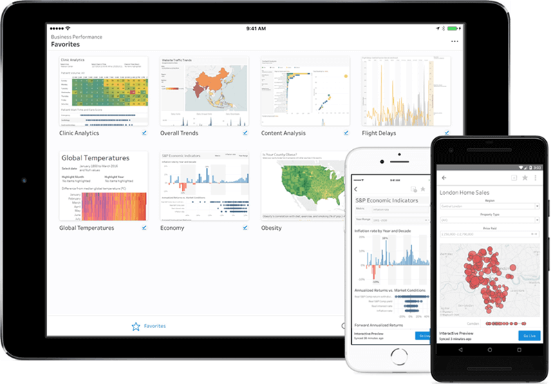 Source: Tableau
Whatagraph
Whatagraph is a marketing reporting tool that lets in-house marketers and agencies create beautiful marketing reports in a matter of minutes. With its wide array of templates, anyone can create a report and connect their most used marketing channels.
Advantages: 40+ data sources and 100+ dashboard and report templates. Lots of customization options including a white labeling feature for agencies. The possibility to transfer data from marketing sources to Google BigQuery and then visualize it.
Cost: Has a free 7-day trial. Paid plans start at $199 per month, which gets you 25 data sources and 5 seats on your team.
Website: Whatagraph
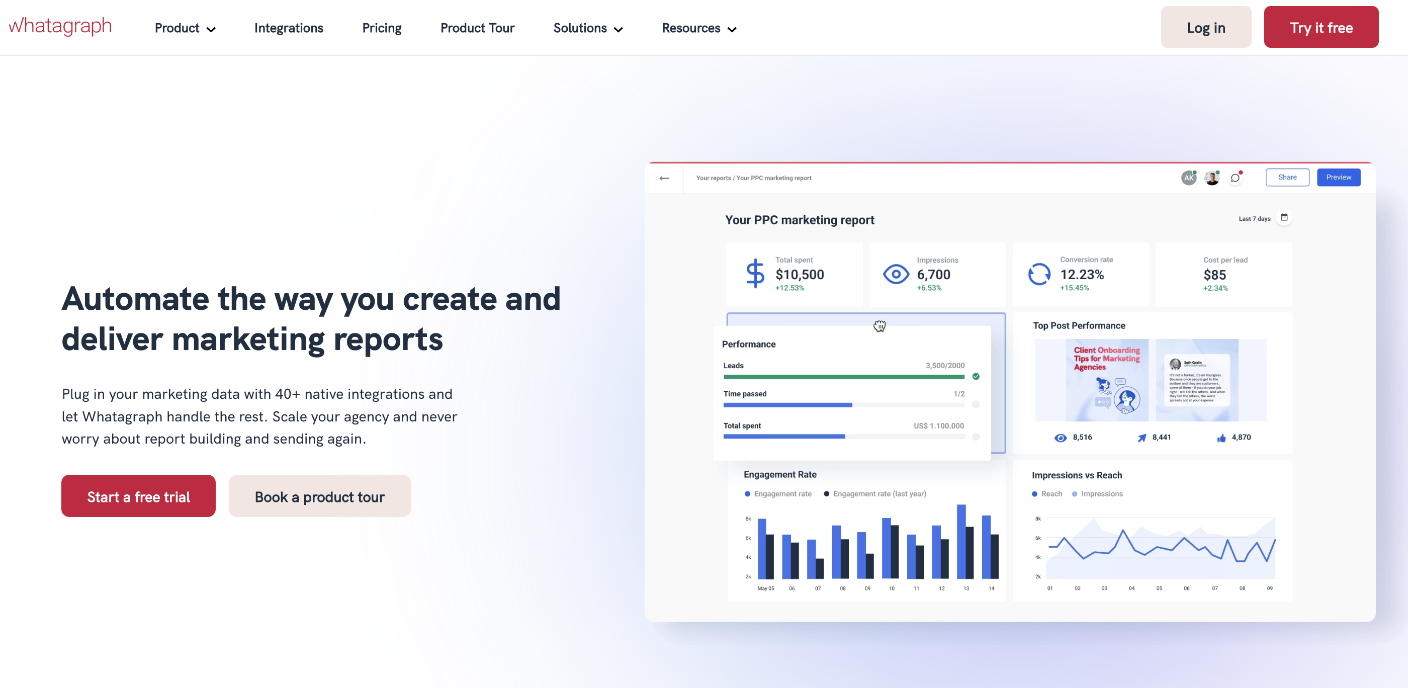
Source: Whatagraph
Sisence
Sisense is a BI tool for creating dashboards to track any type of data. It is a bit more complex than Tableau, but the dashboard tool is still very intuitive. Plus, there are interactive data visualization widgets like Sankey diagrams, scatter plots, and more.
It is possible to create analytics apps using the Sisense API with any data set. Moreover, non-developers can create dashboards without external help.
Advantages: Advanced analytical features and AI-powered assets allow users to discover richer data models that serve granular details to filter and drill down into dashboards.
Cost: Has a free trial. For professionals, prices start from $80/member/month.
Website: Sisence
Databox
DataBox is also a data dashboard tool that is a bit more straightforward than Sisence. It is used by businesses of all sizes to generate data-driven reports and track KPIs.
With a straightforward UI, hundreds of templates, and a drag-and-drop editor for building custom dashboards, everyone can develop reports of any complexity. Databox generates updates and sends alerts through email, Slack, and mobile app notifications.
Advantages: 70+ one-click integrations to connect data directly from Salesforce, Google Analytics, Hubspot, Facebook Ads, and other databases ease storing all data in one place.
Cost: Has a free plan for small teams. A professional plan with more features is $169/month.
Website: Databox
Video editing
VEED
With VEED, you can create content that increases views on social media! You can add subtitles to your videos automatically and translate them in seconds. You’ll even be able to transcribe audio files for maximum accuracy with just one click! All these tools are available on an easy-to-use platform that boosts engagement by making it effortless – no matter what type of content creator.
Advantages: All these features come with a free trial that lasts indefinitely – meaning you’ll be able to try them out before buying-and if they don’t work out the way we want on our own time then there’s no need for any commitment at all.
Cost: Has a free plan. The basic Pro plan starts from $12/month.
Website: VEED.IO
Picsart
Picsart is an AI-powered photo and video editing software that has an endless amount of features, even in its free version. Picsart has everything a designer could ever want: images, stickers, logo makers, ad creators, and more. Its powerful web editor can remove backgrounds and objects with a single click or add filters and effects without fiddling with sliders.
Advantages: Picsart has a beginner-friendly AI image generator that converts text into images in seconds. Simply add a few keywords, select your art style, and generate the image. Once done, you can customize your image with text, filters, and color adjustments.
Cost: Has a free plan. A Picsart Gold plan with access to more features is $5.26/month, and a team plan with collaborating features starts at $4.99/month.
Website: Picsart
Extra: Library
D3.js
D3.js is one of the best data visualization libraries that run on JavaScript and uses HTML, CSS, and SVG. D3.js is open-source and applies a data-driven transformation to a webpage, and allows for beautiful and fast visualizations.
Warning: this library comes with no pre-built charts, and only IE9+ is supported.
Advantages: D3.js is an excellent tool for adding data-driven real-time interactivity.
Website: D3.js
Instead of conclusion
There are too many data visualization tools to name in one article, so we chose our favorites that can be used in a wide range of work processes. Choosing the best one for a particular task or a problem is only half of the way, because the other part is actually doing the work, and it’s on you.
Here’s a note from a design expert about working with data visualization tools for the first time:
If you’re looking for inspiration and valuable tools to visualize data, I recommend checking the works of professionals and trying to replicate it in your unique way without getting caught up with well-known templates and presets. Search for collections of charts, graphs, infographics created by others, or even create your list of resources to get inspired from. Like this one. This way, you will not only learn the technical parts of the design but find your voice in the design world along the way.
Denis Bolshakov, Design Lead at FlowMapp