Without any doubt, usability is one of the keys to the successful performance of your website what makes UX testing an effective method of boosting your SEO. Usability directly influences the amount of your traffic and sales. Probably, two questions arose in your head: What is meant under user experience testing that makes it so significant? & How to conduct an efficient usability analysis? The answers to the following questions, provided by the Plerdy team, you will find further in this article.
Table of Contents
What is usability testing
Usability testing implies the analysis of your website functionality by monitoring real user experience on the site, identifying the difficulties they may struggle with while performing specific online actions on your resource.
By involving real users in UX testing of your website, you get a chance to discover weak sides of your site which you cannot recognize since you’ve simply got used to it. Analysis of the user behavior assists you in building a user-friendly platform with high performance & usability rates.
You can start your website UX research by watching user behavior session recordings. Then, you can refer to usability testing agencies, or take advantage of eye-tracking equipment in specialized labs. No matter how you do it, conducting your website usability testing is a crucial stage of optimization.
How do I know that I need user experience testing?
As soon as one or several of the following questions pop up in your head, proceed to UX research:
- Is my traffic targeted?
- Does my site have a lot of errors?
- Is my website easy to navigate?
- Do all the web elements function correctly?
- Why is the bounce rate so high?
- What’s my sales performance?
Useful Tips On Usability Testing
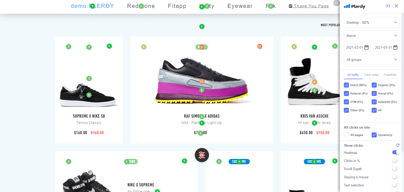
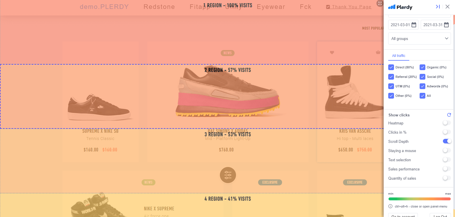
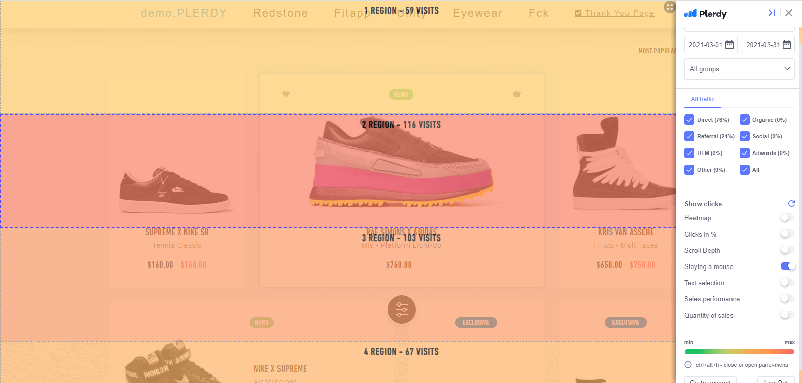
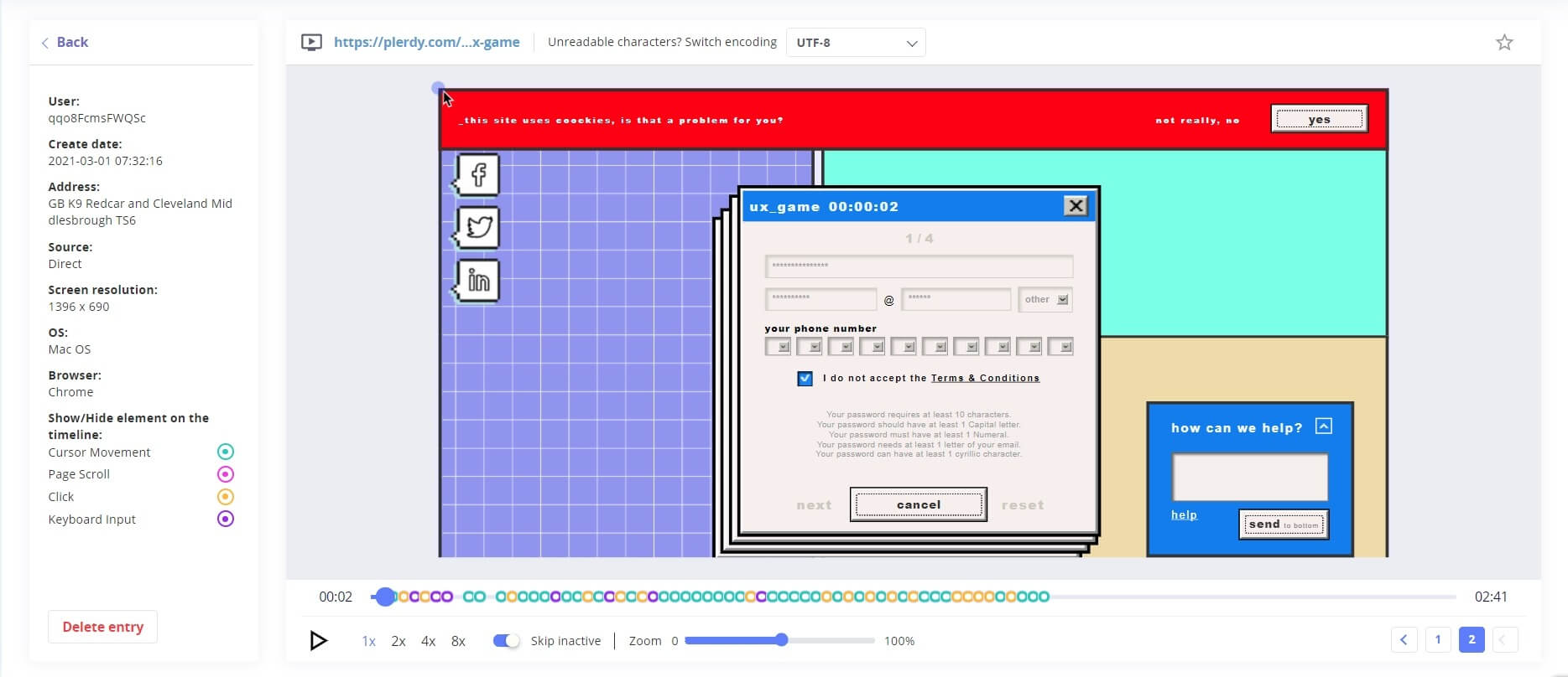
In the illustrations below, you can see how efficient user experience research should be conducted. Here are practical tools in the UX testing process:
- Heatmap analysis. Find out what elements visitors click at most. Mind the clicks in their quantity and percentage. Moreover, pay specific attention to the first click on the page. This will be of great use.
- Scroll depth. Discover how deep your users scroll down and which regions of a webpage are left with little or no attention.
- You are staying a mouse. Follow the cursor hover to understand which parts of your web page draw the most of your user attention.
- Text selection. Get to know which parts of the content your visitors find the most interesting and focus on them for some reason.
- Video sessions. View video records of user behavior on your webpage to identify where they face difficulties.
All the steps are vital to consider since the data received at each stage complement each other and enable you to draw more accurate conclusions. For instance, if you may be mistaken, after analyzing the places that get the most clicks, you conclude that other regions are of no use. Investigate the cursor hover, and you will see that the parts where users do not click but stay for some time are meaningful to them. Another point to bear in mind is to take advantage of the insights you get during usability testing wisely. Notice more active user activity on lower regions of the website, and try moving its elements somewhere in the upper part to involve more users in immediate dynamic interaction with your site.
If you are not confident that you can conduct a thorough website usability testing by yourself, entrust it to professionals, such as Plerdy, Hotjar, Fullstory, or Crazyegg. The experienced specialists will check out your website, identify the mistakes, and provide detailed recommendations for their fixing.
A comprehensive usability testing enables you to identify deviations and correct them, thus normalizing all the factors that influence CRO, including the following ones:
- Website structure. Here belong coherence and cohesiveness of content, logical transitions between related blocks/pages, intelligible navigation, untypical or poorly thought-out placement of elements, lack of information needed.
- Layout. Availability of adaptive web design, broken structure, including stacking or overlapping elements.
- Unfunctional elements. Unclickable buttons, broken/nonexistent links lead to nowhere, empty pages.
- Redundancy. Odd animations, slowing down the site load speed, distracting elements bearing no use to users, too complicated registration procedure with unnecessary steps, frequent pop-ups especially without a close button, vexatious captcha, annoying ads.
- Design. Multicolored gamut, flopping color scheme, inappropriate text and background, unaddressed textual design, low-quality media elements.
- Content. Out-of-date info, absence of key pages/blocks, lack of CTA, textual mistakes.
- Size. Improper width of textual blocks, complicating reading, disproportional images.
With a clear understanding of what shouldn’t be done if you don’t want to scare away your prospective consumers, you will be able to enhance your site’s usability and CRO, respectively. An essential piece of advice here – if you want to implement some unique tricks on your website, change the ordinary things in its design, get your visitors ready for that. Inform them on changes in advance, leave textual hints to navigate them, accentuate new elements, do whatever you want but make sure that you make the user experience on your site as accessible and troubleless as possible. If you want them to do specific actions, provide them with opportunities to do it quickly. If you cannot ensure that your visitors understand your novelty, you’d better stick to generally-accepter norms that often guarantee more excellent usability to your resource than the attempts to implement something new.
To make your website user-friendly, you shouldn’t overload your resource with unnecessary elements, distracting visitors from the target action you want them to perform. However, you shouldn’t underload it, leaving visitors at a loss concerning what they should do there.
For example, when developing logistics software, it is crucial to strike a balance between providing comprehensive features and functionality, without overwhelming users with excessive complexities or leaving them unsure about how to navigate the system effectively.
In particular, avoid using:
- banners on the home page;
- long-reads that convey little sense;
- non-obvious icons;
- obscure CTA;
- identical, repetitious info;
- pop-ups (although these can be done right).
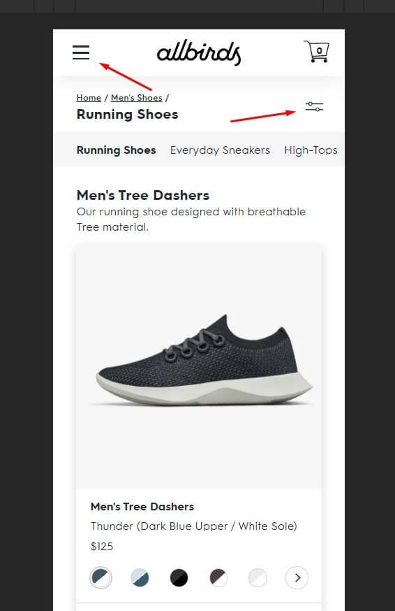
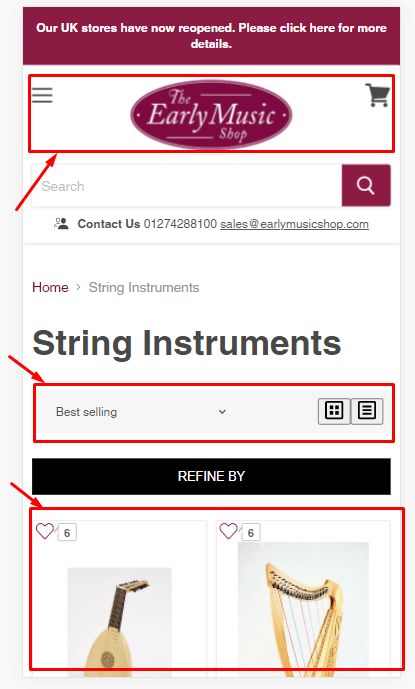
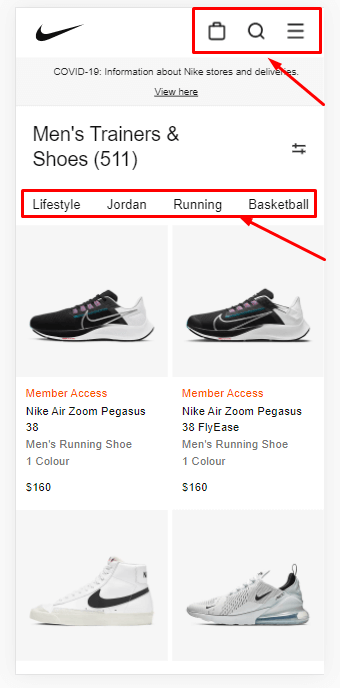
To exemplify the given idea, let us draw your attention to the following screenshots. They lack a kind of CTA, like “Order Now,” or textual hints, like “Menu,” “Filters.” Otherwise, one would better understand what they actually can do on the page.
Good usability is exemplified in the following screenshot. It features accurate product filtrating. Also, for greater user convenience, the products are displayed by two items in a row, enabling customers to remain focused.
The success of user experience on your website also depends on how you arrange its key elements. Customers will find your online store away more convenient if they access the required sections without wasting time searching. Here’s an example of a proper arrangement of the main areas:
Conclusion
Website usability testing allows you to reveal confusing regions where prospective clients get lost on your web page and improve the user experience by fixing the issues identified. You can try to test your website with the tips above or get a usability expert review of your site from the specialized agencies fitted with their efficient usability testing software.


